

Seating Chart Tool Usability Testing
INFINITE CAMPUS
UX RESEARCH / ENTERPRISE SOFTWARE
ROLE
UX Designer
TIMELINE
8 weeks
BACKGROUND
System Preferences is a powerful tool that allows for the configuration of settings for the general use of Infinite Campus. The System Preferences tool had been neglected and outdated. The development team reached out because they were tasked to update the tech stack of the tool. With that, they also reached out to the UX team for guidance on how to improve the experience and workflow of the tool.
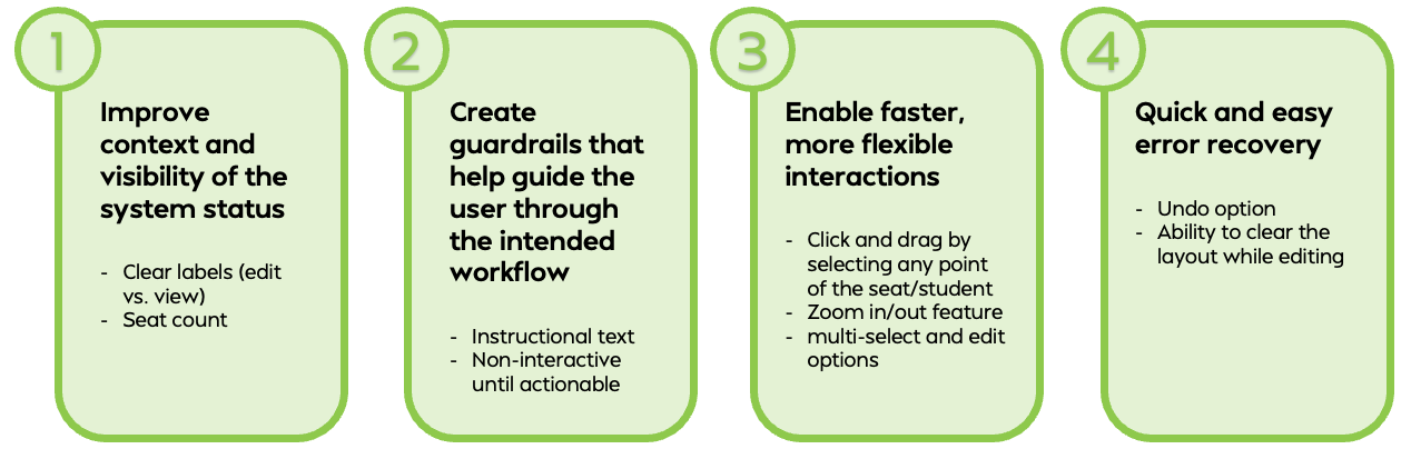
DESIGN RECOMMENDATIONS
Improve context and visibility of the system status
Create guardrails that help guide the user through the intended workflow
Enable faster, more flexible interactions
Quick and easy error recovery
Let’s get into how we got to these recommendations…
METHODOLOGY
1 Hour Usability Testing Sessions
n = 4 participants
User Group: Teachers
TEST PLAN
Introductory Questions
Scenarios
5 Core Scenarios:
Create a Seating Chart
Combine Multiple Sections
Edit an Existing Seating Chart
Print a Seating Chart
Record Attendance Using a Seating Chart
Product Reaction Cards
List of Positive and Negative Words to Measure Participants’ Attitude Towards the Tool
Debriefing Interview
List of 6 Reflective Questions Asked to Participants After Going Through the Testing
TESTING INSIGHTS
Create a Seating Chart
You’re preparing your classroom for next week’s lessons. You want a layout that supports discussion and small group work for one section you teach.
Task 1: Create a new Seating Chart layout that groups students for collaboration. Save it for later use.
Notes:
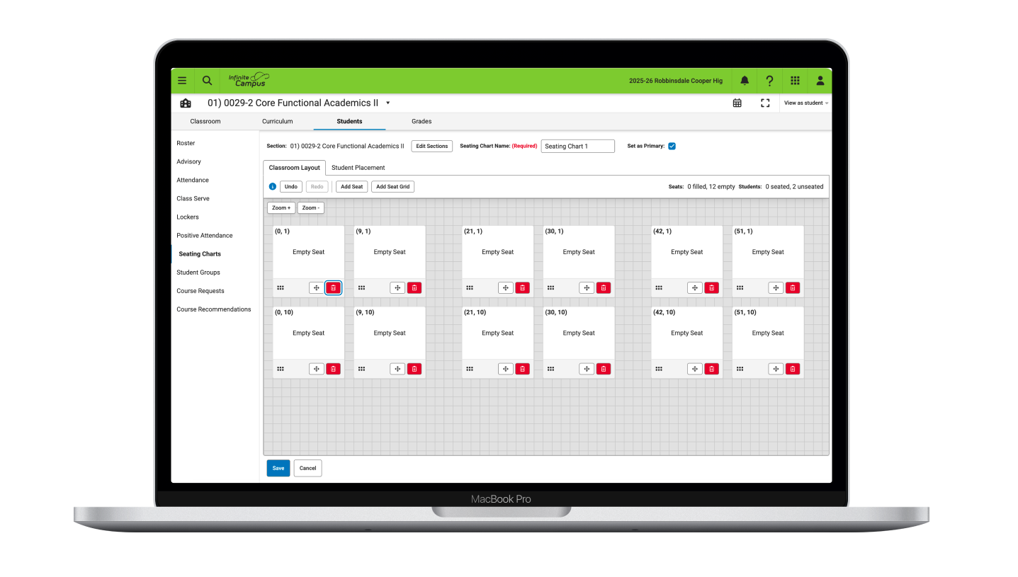
Missing guardrails and feedback from the tool
Users wanted to ’undo’ and ‘clear’ functions, as well as basic feedback like seat count
Tedious movement and interactions
The grabber icon was not obvious
Managing seats at an individual level felt cumbersome
Scrolling and Spatial Control Frustrations
Excessive scrolling (both horizontal and vertical) was frustrating
Create a Seating Chart (cont.)
You’re preparing your classroom for next week’s lessons. You want a layout that supports discussion and small group work for one section you teach.
Task 2: Place students so everyone has a seat. Use any approach that makes sense to you.

Notes:
Edit vs. View only mode confusion
Users tried to drag students while in the view-only mode
•More visibility is needed on seating status
Need clear indicators to avoid miscounted seats and missed students
Liked ‘set as primary’ option
Quotes:
"I've never done a layout”
"It would be helpful if it told me how many seats I had, so I didn't have to count them”
Quotes:
"That was very easy to do, I like the extra options [autoplacement]"
Combine Multiple Sections
You’re combining two sections of integrated math because they are meeting in the same room for the same period.
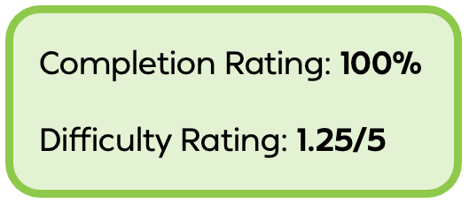
Task 3: Combine the two sections and create a seating chart with all students seated in rows.
Notes:
Combining sections was easy for all users to complete
More issues with layout and seat grid
Users wanted multi-select and ‘clear seats’ functionality
High cost of errors
Users repeatedly left the seating chart and created new ones rather than correcting mistakes
Poor recoverability
Quotes:
"Just took me a minute to find that button"
"This function [edit sections button] would be nice when it comes to my AP testing time, then I can combine two of my classes together"
Edit an Existing Seating Chart
Shayla Car is a student who needs to sit near the front due to low vision.
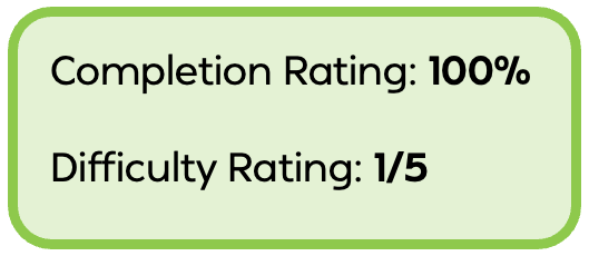
Task 4: Edit an existing seating chart by moving that student to a more suitable spot and make any seat changes needed to support that move. Save your changes.
Notes:
Orientation uncertainty
Users are confused about whether the top or the bottom of the workspace represents the front
Considered the printed output and how that would read
Learnability of the tool improves, but only after repeated interaction
Tool can be usable but lacks early affordances and cues
Quotes:
"This is where it can be confusing….what is the front of the room?”
"When this prints, this [bottom of the workspace] would be more like the front as I'm reading it on paper”
"Now that I'm used to this guy [grabber icon], it's totally easy"
Print a Seating Chart
You need to leave a printed copy of your seating chart for the substitute teacher.
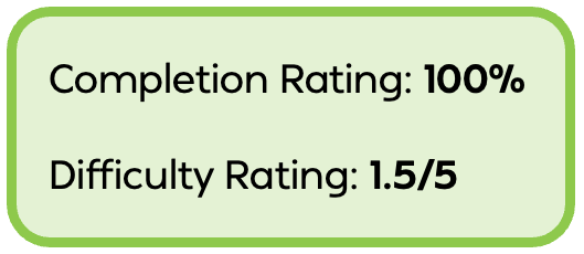
Task 5: Print the current seating chart used for your class.
Notes:
Limited control over print layout fitting
Offering auto-fit options could minimize frustrations with having users manual seat repositioning
Printing workflow is click-heavy
Many clicks needed before you can print the seating chart
Quotes:
"I have to click here [print button], and then I have to decide which of these I want, and then…hit print, and then it brings up another PDF for me to do"
Record Attendance Using a Seating Chart
Class just started. You are recording who is present, tardy, and absent.
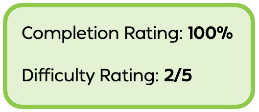
Task 6: Mark attendance for all students using the seating chart. Save any changes made.
Notes:
Inconsistent features with list-based attendance
No feature to add a comment in the seating chart mode
Seating chart attendance in the side panel led to high frustration
The view was constrained and complex
Quotes:
"Don't love that I have to scroll through to see everything… I wish I could just see it all at the same time”
"There's got to be a better way to do that [side panel seating chart]”
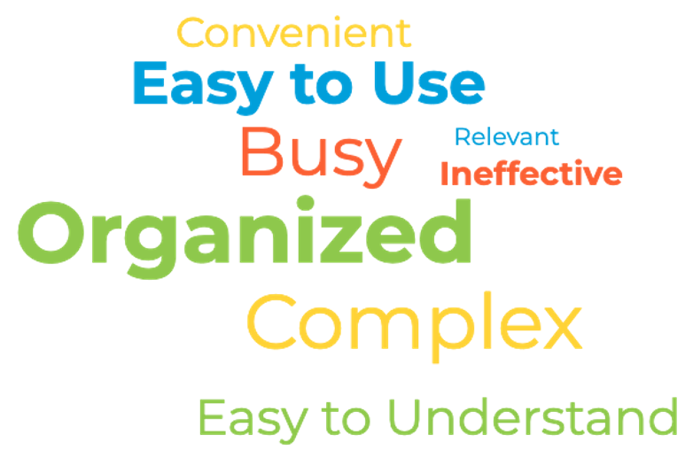
PRODUCT REACTION CARDS
Positive reaction to the updated look and grid background
Standout features are ‘Combining Classes’ and auto-placement options
Usability frustrations related to navigation, visibility, and manipulation
Design recommendations center on flexibility and ease of use
Feature requests for zoom controls, multi-select, text fields, and non-student objects
DEBRIEFING RESPONSES
Lack of Context and System Clarity
Edit mode and view mode are not clearly differentiated
No indicators of how many seats are placed in the layout
Missing Guardrails Lead to Confusing Workflows
Why allow users the option to place students if they haven’t set any seats down?
Frustrating Movement and Interactions
Excessive horizontal and vertical scrolling
The grabber icon was not obvious
Only able to edit seats at the individual level, making layout changes slow and repetitive
High Cost of Mistakes with Poor Recovery Options
Unable to easily undo actions or clear a layout
As a result, users repeatedly left the tool entirely to start again
This behavior indicates low confidence in making and correcting changes within the tool
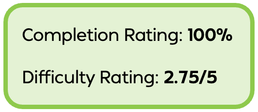
This study reminded me that task completion doesn't always mean a great user experience. While every participant successfully completed the scenarios, observing their confusion, hesitation, and workarounds revealed several opportunities to make the Seating Chart tool more intuitive and forgiving. What stood out most was how often users expected familiar interactions such as undo, multi-select, and clearer visual feedback. Seeing these struggles firsthand reinforced the importance of designing around users' mental models rather than expecting them to adapt to the system. As a UX designer, this project was a valuable reminder that small improvements in clarity, feedback, and error recovery can have a significant impact on user confidence and overall satisfaction.
MAJOR PAIN POINTS
DESIGN RECOMMENDATIONS
TAKEAWAYS